If you're wondering how landing pages work and why they're important, you're not alone. When you're new to online marketing there can be a lot of confusion about how and when to use them, how to design them and how important they are when it comes to helping you earn online.
It's important to provide potential customers with options that will allow them to take the next step with your business whether they have questions or want to learn more. The goal is to convert a visitor into a lead.
You need pages (landing pages) that will hep them convert from a visitor to a lead and ultimately when they are ready to make a purchase, you'll turn that lead into a customer.
This article and video training will show you how to create effective landing pages that include a great looking format with opt-in forms that connect with popular email marketing platforms and that can be placed in multiple places on your page.
The goal is to use opt-in forms that don't just sit in the sidebar of your page, but forms that blend in with the look, feel and tone of your pages.
Using the right landing page elements on your pages can go a long way to get your business off the ground, allowing you to reach your full potential as a business owner.
Don't miss out on reaching your financial goals because you're not using landing pages effectively.
This article and the training video below will provide you with the components of an effective landing page that does the important job of helping you sell more products and services.
Step by Step Video Training
Part 1
Part 2
PayPal Buttons
Stripe Buttons
What is a Landing Page?
Landing pages are important because many times they are the first step in creating a relationship between your company and potential customers. They don't typically have top, side or bottom navigation.
No navigation is provided because you don't want users who come to your landing page to get distracted. Distracted visitors might not complete the desired action.
The Primary Goal of a Landing Page
That's bad news if you're interested in selling products and services, because most people don't usually buy anything on their first visit.
After all, they know nothing about you or your business and whether you're someone they want to do business with.
So in essence, your success in running an online business will be limited UNLESS you do something to get potential customers to (1) visit your site in the first place and (2) to return to your site to engage and buy. And that's where using a great looking, well designed landing page comes in.
Landing pages are an integral part of the selling process because they give your visitors a reason to return to your platform to do business with you.
The primary job of a landing page is to solve a problem for your visitors, helping them convert from someone who just visits your site into someone who is motivated and eager to learn more about your products and your company. In essence, the job of a landing page is to turn visitors into leads... That's it.
That's the primary job of a landing page, but it's a very important one. It's goal is to help your potential customers solve one burning problem or issue.
Your landing pages should focus on one problem or issue that keeps your potential customers from accomplishing their goals and living their best lives.
A realistic conversion rate for visitors to leads is about 20%. If you can just convince 20% of your visitors to become a lead, you're doing well. A great way to measure this is to look at your Google Analytics data to compare new versus returning visitors.
How Landing Pages Work
This is how landing pages should work:
- A potential buyer sees your content (link, image, video, etc.) that addresses a problem or an issue they are having. Your potential buyer likes what they see and they click your link, ending up on your well designed landing page.
- This landing page includes (1) an opt-in form, (2) information that zeros in on the problems or issues your potential customers need help with. It also (3) provides a solution (your product, course, affiliate product, etc.) that potential customers can purchase to address the issue or resolve the problem.
- Because the person likes what they see on the landing page, they either (1) complete your opt-in form, which takes this person from a visitor into a lead and results in your first conversion or (2) they make a purchase and they become a customer which is the ultimate goal. In either case, Congratulations, your landing page has achieved served it's purpose in helping you achieve your income goals! But that's not where the story ends. Read on...
What Happens Behind the Scenes
- Before you set up your landing page, you should sign up with an email marketing provider like like aWeber, Mailchimp, ConvertKit, etc. Your email marketing provider plays a key role in helping your set up a winning system that helps you reach your income goals through online marketing. Read on...
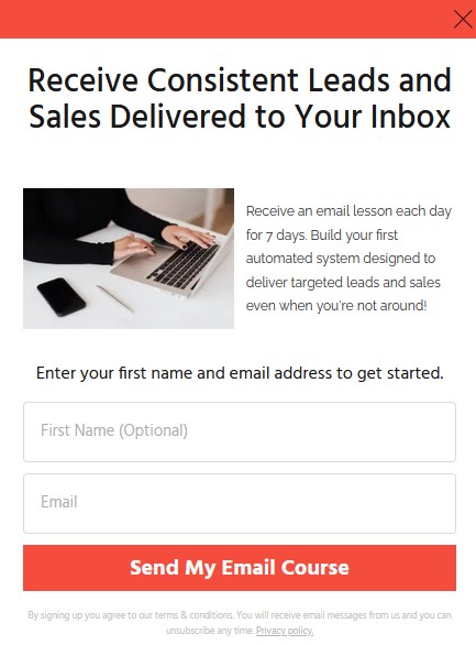
- On a well designed landing page, the opt in form (like the one shown above) conveys a call to action for your visitor. If the visitor signs up, the form communicates with your email marketing provider using an autoresponder.
- The information the potential customer fills out in the opt in form fields (usually first name and email address) are processed by your autoresponder and stored in the leads database provided by your email marketing company.
- This is also referred to as building a list. This behind the scenes process enables your business to start a conversation with your new lead or customer based on what they signed up to receive from you.
- This conversation can help you build an audience of people who have the potential to become your biggest fans and product advocates. The ball is in your court after you receive their contact information to create the "know, like and trust factor" with this special group of people that can set your business on the path to success.
Build a Loyal Following with Thrive Leads
Place well designed, aesthetically pleasing lead generation elements wherever you need them, with simple drag and drop functionality.
Enter your first name and email address to start generating more leads and sales.
There is a lot going on behind the scenes of a well crafted landing page that can help you grow your business exponentially.
Imagine what would happen if you had 2000 people per month who completed your opt-in form and became a lead. How would that help you?
The end result would be an audience of loyal, invested people who are interested and potentially ready to buy what you have to offer. As long as your users stayed on your list you would have the potential to send them helpful information, and resources that would motivate them to return to your site, shop or channel again and again.
Using landing pages gives you the best way to consistently bring more and more potential customers into your business and keep them there.
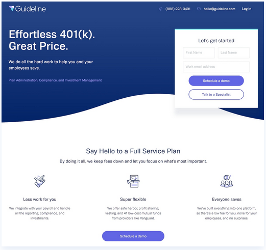
An Example of a Landing Page from Guideline
Here is a landing page from Guideline, and it provides just enough information to help potential customers understand who they are and what they do.
If someone is interested in what they do, they can provide their contact information and request a demo or talk to a specialist. What do you like about the format and content on this landing page? What would you do differently if this was your business? Would a landing page like this work to help your business?
So it’s important to keep your landing pages as simple and focused as possible. Here's another example of a well designed, great looking lead generation landing page.
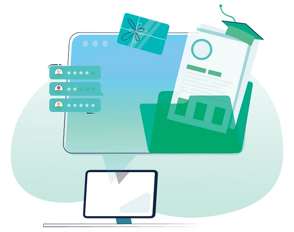
Sales Pages That Convert
Make your business dreams a reality with sales pages that convert! In this course you'll learn exactly how to write conversion focused sales pages without spending years learning copywriting.
A Landing Page from Great Jones
Here's another example of a lead generation landing page that provides potential customers with a coupon for significant savings on a set of cookware. Anyone who signs up will receive a savings of $100, and depending on the price of the cookware could result in huge savings.
What do you think about this landing page? Would this motivate you to take action? How do you think your audience would respond to this landing page? What do you like (or not) about this landing page? What kind of content would motivate a potential customer to become a repeat buyer once they make their initial purchase? Would this kind of landing page work for your business?

The Three Types of Landing Pages You Should be Using
There are three main types of landing pages you should be using to grow your business. Sales, lead generation, and click through pages. Each type has its own purpose and benefits.
- A lead generation page is one of the most popular types of landing pages. They are important because they help to begin the relationship between your company and your prospective customer.
These pages are used to build your on your email list and commonly include an opt-in form and lead magnet.
When someone signs up to become a lead, they are giving you a nod to send more information. It's important to structure these pages so that they help readers understand what your company does and why they should care.
The tool we use for high converting lead generation pages is Thrive Architect, the sales and marketing toolkit we used to create this site.
You can also make announcements for things like events using landing pages. We have a landing page that introduces visitors to our podcast. - A sales page is designed to do just what the name says... sell products and services. These kinds of landing pages usually contain lots of copy and their goal is to educate your visitors and provide the details they need to make a purchase.
Your goal is to pitch your product with convincing testimonials, quotes, videos and calls to action (CTAs) to persuade the visitor to buy.
If you don't have a shop, you can set up PayPal or Stripe buttons to allow customers to buy products right from your sales page. Otherwise you would simply direct buyers to your shop to check out.
To learn more about writing sales pages that convert, take a look at a course called Sales Page Blueprint that helps you structure your pages in a way that provides your business with a much needed sales and conversion boost.
It's important to have a fresh set of eyes to review your sales pages before you launch to ensure that they have the information a buyer would need to make the decision to move forward with a purchase. - A click through (also known as a bridge page) is designed to provide detailed information about an offer to persuade the visitor to "click-through" to a transaction page.
These types of landing pages can serve as a middleman between an ad and your online store or an affiliate page.
They are commonly used to allow visitors to become familiar with a service or features without being asked to make a purchase immediately. Click through pages can also be created using Thrive Architect.
There are other types of landing pages like splash pages, thank you pages, and more. But these are the three pages you should implement as soon as possible, to start getting results with a new online business.
Understanding the Anatomy of a Well Designed Landing Page
The elements in this section will help you create great looking landing pages that perform well from a functional standpoint. Using the right combination can mean the difference between earning more and reaching your income goals, versus struggling to barely covering your expenses.
The components of a good landing page include: a hero image, headline, subtitle, supporting copy, an opt-in form, and a call to action button.
Learn about each component and how you can use them to build better landing pages for your business.
- A Hero Image - This is optional. It helps to grab the attention of potential customers and tells a story that supports what you're trying to accomplish with your landing page. For example, if you're selling a product, you would probably want to have a hero picture of someone using the product. It's large and attention getting, helping the visitor understand why they need to take the desired action.
- Headline - The headline has one goal and that is to grab the attention of potential customers and motivate them to click on your page. Your headline comes up in search results, and has to compete with other headlines that are providing the same kind of information.
- Subtitle - You can have a subtitle that provides more detail and supports the headline. Though your headline may not be seen in search results, once someone clicks on your headline it can provide a detail potential leads and customers need to make a decision on whether your solution is the right one for them.
- Supporting copy - This is optional. You don't want to go on and on with any supporting copy. But if you decide to include supporting copy, it should zero in on the ideas, goals, pain points and motivations your customers are experiencing.
You can include short paragraphs or bullet points that will provide enough information to let readers know what they are getting, who it's for, whether your solution is a fit for them. - An Opt-in Form - You'll need a form that will receive reader's email address and contact information. To be effective, make your form relevant to what you're trying to accomplish. For example, if you are asking readers to schedule a call, you'll need a phone number.
It's also important to use opt-in forms that look amazing, helping your page to do the job of converting people from visitors into leads.
You want to keep your form as brief as possible, only asking for the basic information needed to establish contact and nothing more. To communicate with an audience online, you'll definitely need the email address. Some companies will ask for the first name as an option so that they can personalize the communication. - A Call to Action - Readers should be crystal clear about the next steps you want them to take. For example, if your landing page is designed to gather leads, you'll need a button that enables visitors to submit their contact information once they have completed the opt-in form.
If your landing page is a sales page, you'll need a button that enables the visitor (or lead) to purchase your product. The button should say something that motivates the visitor to take action. Something like "Buy Now" or "Yes, I'm Ready to Get Started".
Success Doesn't Happen Overnight
Excelling in the area of online marketing is not something that happens overnight. It can take a number of tries before coming up with the right combination of words, images, formats and even colors when promoting products to your unique audience. That's where A/B testing can play a critical role.
Keep in mind that there is not a one size fits all solution for every audience. What might work with my audience, may not work with yours.
Understanding your audience is a big part of winning with online marketing. At the same time, you may need to test different versions of your content to determine which pages, posts, images, etc., will get the best results.
Thrive Optimize is another tool included in Thrive Suite that enables you to run A/B tests for pages, titles, lead generation forms, calls to action and more.
It does an amazing job of helping you figure out which pages, opt in forms, calls to action, images etc., will provide you with the best results. You basically set up two sets to compare to each other, and initiate the test. Thrive Optimize will send traffic to both items in your comparison, and the one that gets the most instances of the desired action wins.
You can set it to run in the background for a period of time or until a clear winner is determined. Once a winner is determined the tool will stop the test and send all traffic to the winner. Amazing, right!
Test Your Business Ideas
Have a product you wan to sell? Discover how to build a testing system that you can use to continually improve your sales and marketing results and connect with an audience of people who want and need your products.
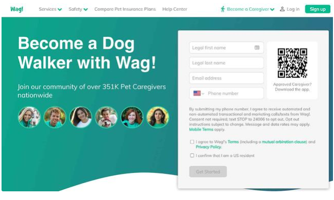
Here's an Example of a Landing Page from Wag
This is another lead generation landing page used by Wag, to recruit new dog walkers. It gives people who are interested a way to submit their information for consideration. There is even a QR code they can use to bring the form up on their cell phones. This page has top navigation, and enables readers and potential dog walkers to learn more about the company before signing up.
What are the strengths and weaknesses you see in this landing page? Would it motivate you to become a dog walker? Would this kind of landing page work for your business? Why or why not? Do you consider the QR code a plus or minus?
Create An Effective Call To Action (CTA)
It's important to make sure that when people visit your landing pages, they're clear about what they should do next as they read through your page. What action do you want them to take? This is usually done with a form that asks them to become a lead or a button that asks them for the sale.
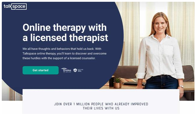
This landing page from Talk Space makes it crystal clear what they do. And it has a button that says "Get Started". Is this a call to action that makes it clear what to do next? How would you improve this page? Would a button that says "Schedule an Appointment" be better? Why or why not?
Would you say that this page is more focused on lead generation or sales? Why or why not?
Include Keywords In Your Headline
It's also important to use keywords in your headline and supporting text. This will help search engines find your landing pages easily. Optimizing your site and landing pages for SEO is important because you want as many potential customers to find your page and take the desired action as possible.
We use Rankmath as our preferred SEO tool. It's a WordPress plugin that enables you to perform keyword research for each post and page on your site. And it integrates with Google Analytics and Google Search Console for detailed reporting. Check out its features to see if it is a good fit for your business.
Write Copy That Sells
A good headline grabs attention and entices people to read further. But once they click the link and land on your content, your copy needs to close the deal. So it's really important to learn the art of creating copy that sells.
Good copy is specific and helps to not only tell readers what your content is about and how it can help them, it also helps to weed out people who are not a good fit for your business. It tells readers who the content is for as well as who it's not for.
Copy that sells, also appeals to the emotions that will motivate readers to take the desired action. If your landing page is designed to convert visitors to leads, it should focus on the problems your site helps readers solve.
If your landing page is focused on selling products, its important to focus on the benefits your readers will receive. It should do a great job of telling readers what's in it for them, when they buy the product.
A general rule of thumb is that you should have one landing page per product or service you're selling on your site. That way, you can track conversions from each individual page.
To learn more about writing sales pages that convert, consider taking Sales Page BluePrint online course. If you want a boost to your sales and conversions, this course is worth checking out.
Using tools like Google Analytics to track your pages will give you lots of great information you can use to determine whether your landing pages are working or not.
Subscribe to Our YouTube Channel
We're helping creative business owners go from stuck and confused to empowered and thriving one video at a time.
Follow us on social media!
Sell More of Your Creative Products
Create sales pages that do the job of converting your online visitors to customers with an easy, affordable online course.
